RESEARCH
TIM HECKER
Tim Hecker is a Canadian ambient composer known for making dense, textured electronic music that sits somewhere between beauty and discomfort. Instead of traditional melodies, he works with layers of sound drones, distorted tones, faint melodies, and noise that feels almost physical. His music often feels like it’s breathing or decaying in real time. What makes him stand out is that his work never fully relaxes into background music. Even when it’s soft, there’s usually tension underneath it, like something slightly unstable trying to hold its shape.
Over the years, his style has moved from more glitchy, abrasive sound experiments to more cinematic, immersive compositions, often influenced by film scoring and large atmospheric spaces.

NO HIGHS
No Highs (2023)No Highs is one of his most recent albums, and the title basically sets the tone: it avoids big euphoric “payoff” moments and instead focuses on restraint, tension, and atmosphere.The album feels very controlled and heavy, built from: slow, shifting dronesfaint electronic pulses and mechanical texturesdistorted, almost orchestral layersmoments of fragile beauty that never fully resolveTracks like “Monotony” start very minimal and gradually build into dense, overwhelming sound fields that feel more like environments than songs.Overall, No Highs feels less like emotional release and more like sustained pressure like being inside a space that keeps changing shape around you, without ever fully settling.
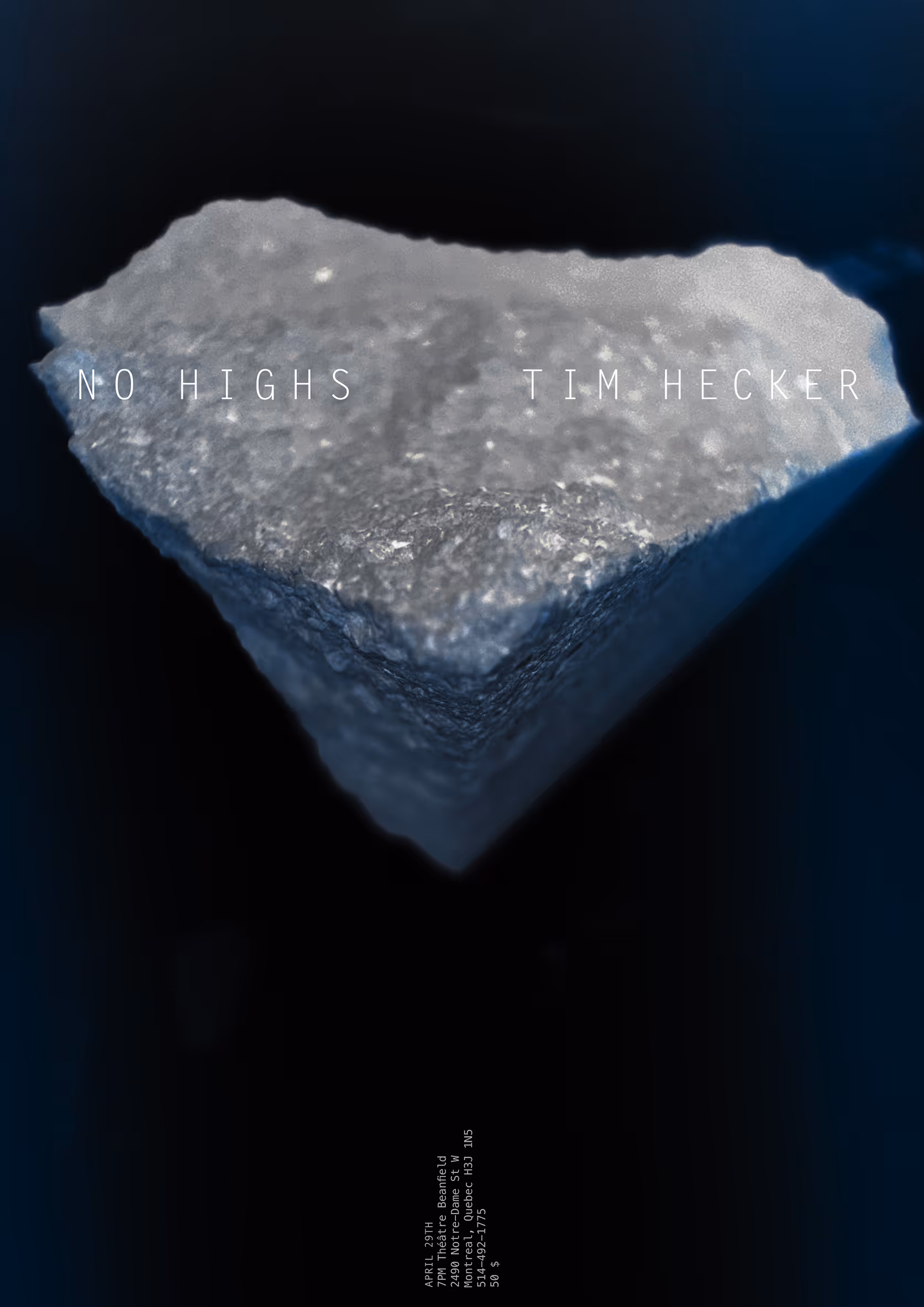
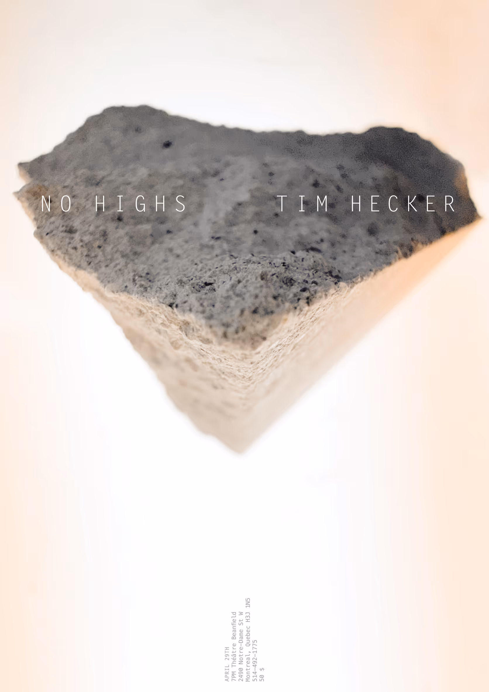
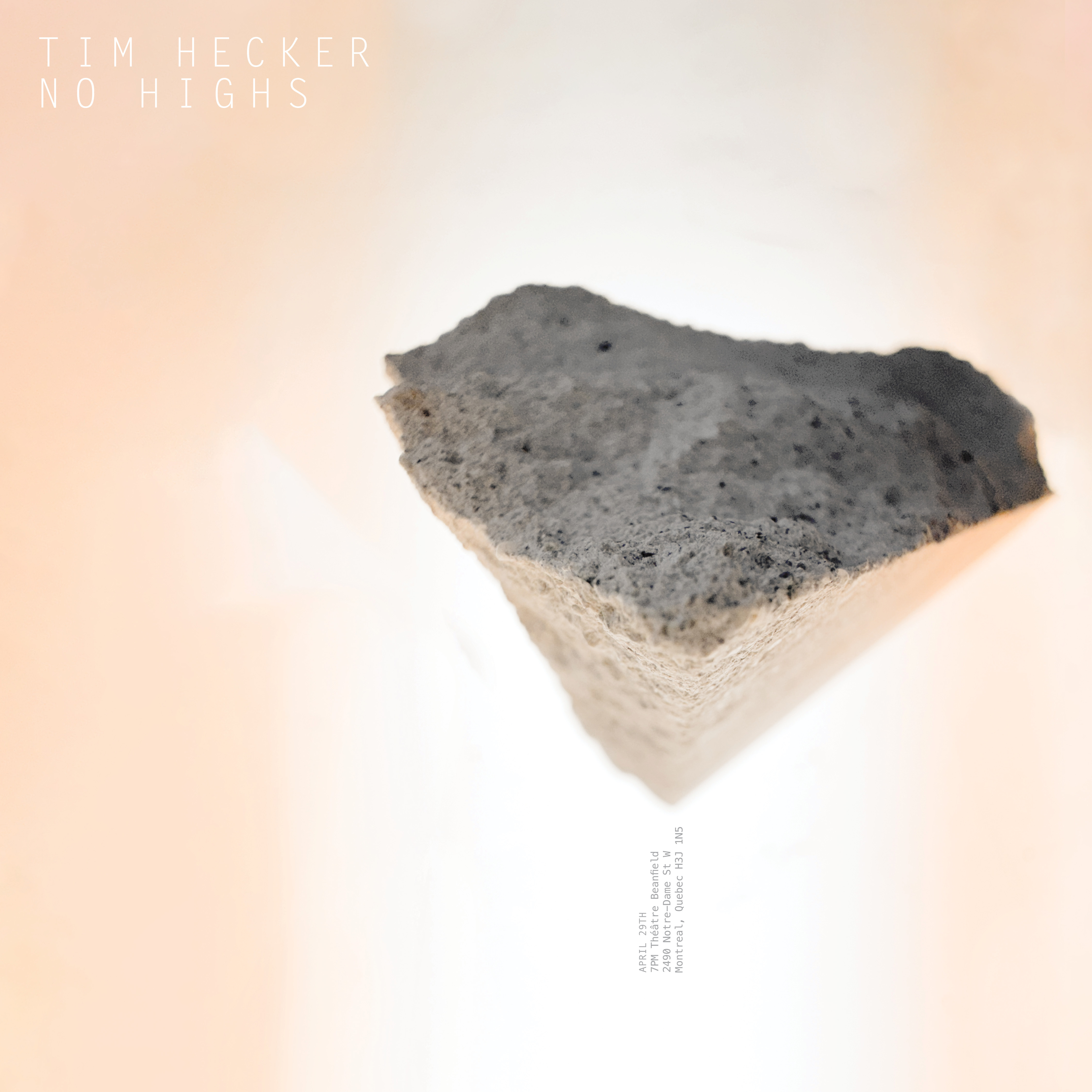
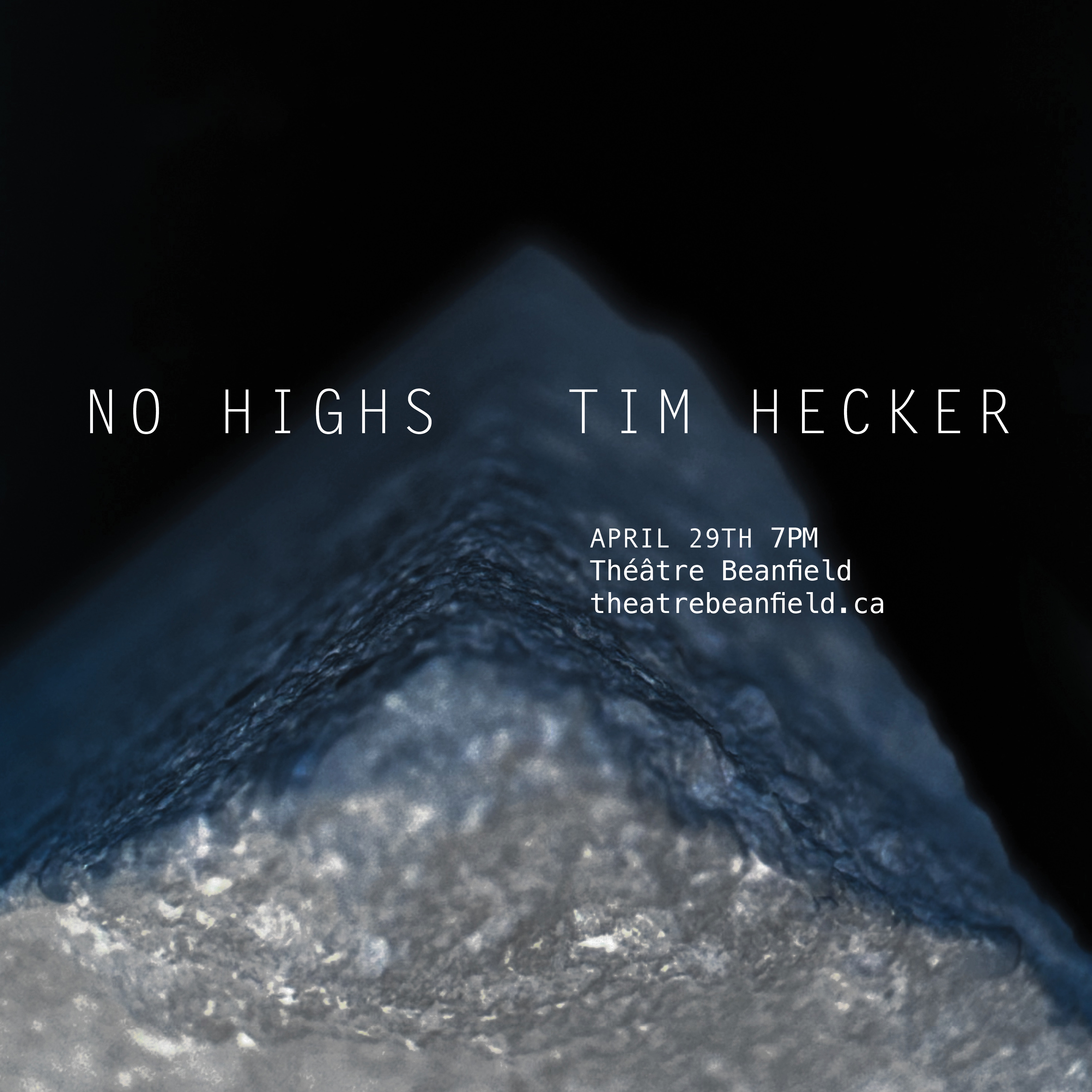
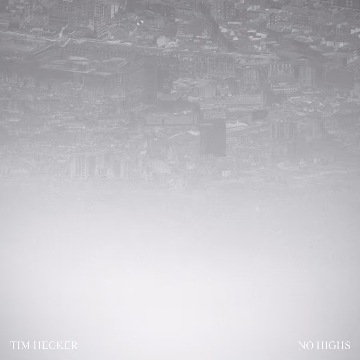
The cover of No Highs shows a blurry, upside-down cityscape covered in fog and grey tones. It feels cold, distant, and slightly unsettling, matching the album’s heavy and atmospheric sound.
my interpretation
concept
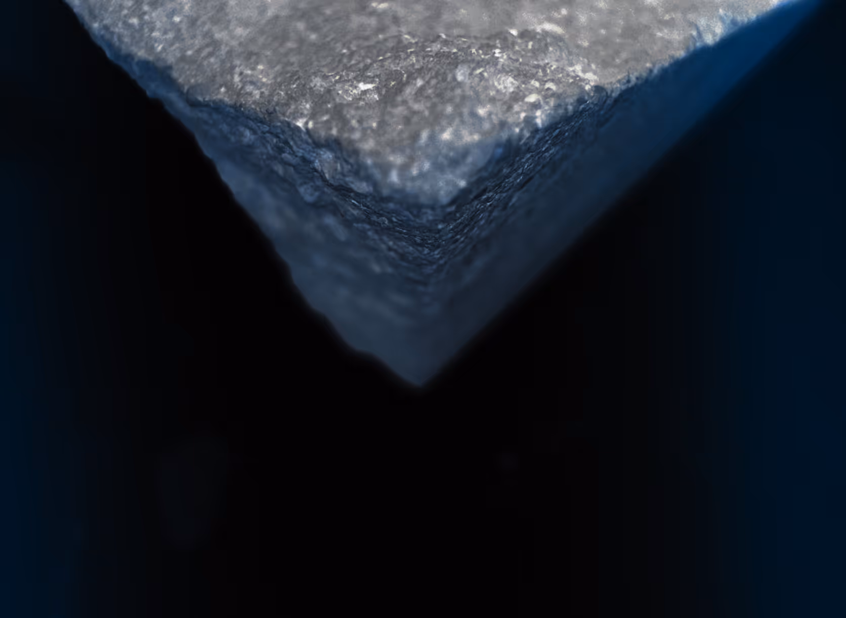
Sharpness :
In No Highs, sharpness is often felt through dissonance and abrasive textures. Rather than a clear-cut, crisp sound, sharpness here is the tension between the physicality of the sound and the organic, sometimes messy layering of frequencies. It’s as though the sharpness is both painful and beautiful, splitting through the warmth of ambient sound. The sharpness doesn’t necessarily feel clean or neat but is instead jagged, erratic, or even painful. It’s an exploration of what lies beneath the surface of sound, exposing a sharp emotional edge.
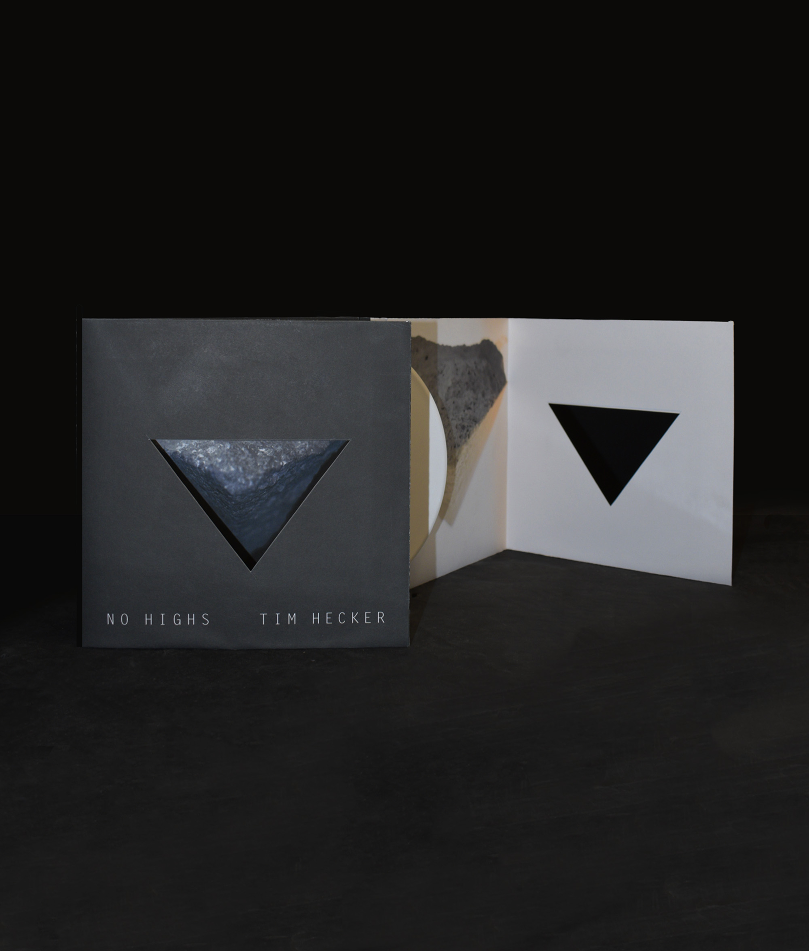
the poster
Having two poster variations allowed me to explore two different visual directions while still staying rooted in the same emotional tone. The lingering sense of anxiety present in Tim Hecker’s No Highs made it difficult to settle on a single colour palette, since both lighter and darker approaches could communicate different parts of that feeling. I found myself leaning more toward the darker version, as it felt more aligned with the weight and tension of the album. However, both designs ultimately reflect the same atmosphere and capture the mood of the music in their own way, just through slightly different emotional emphasis.
social iterations
instagram
youtube
vinyl iteration
checkout more of my works!
NO HIGHSTIM HECKER
Music Rebrand
see more