HAY

branding

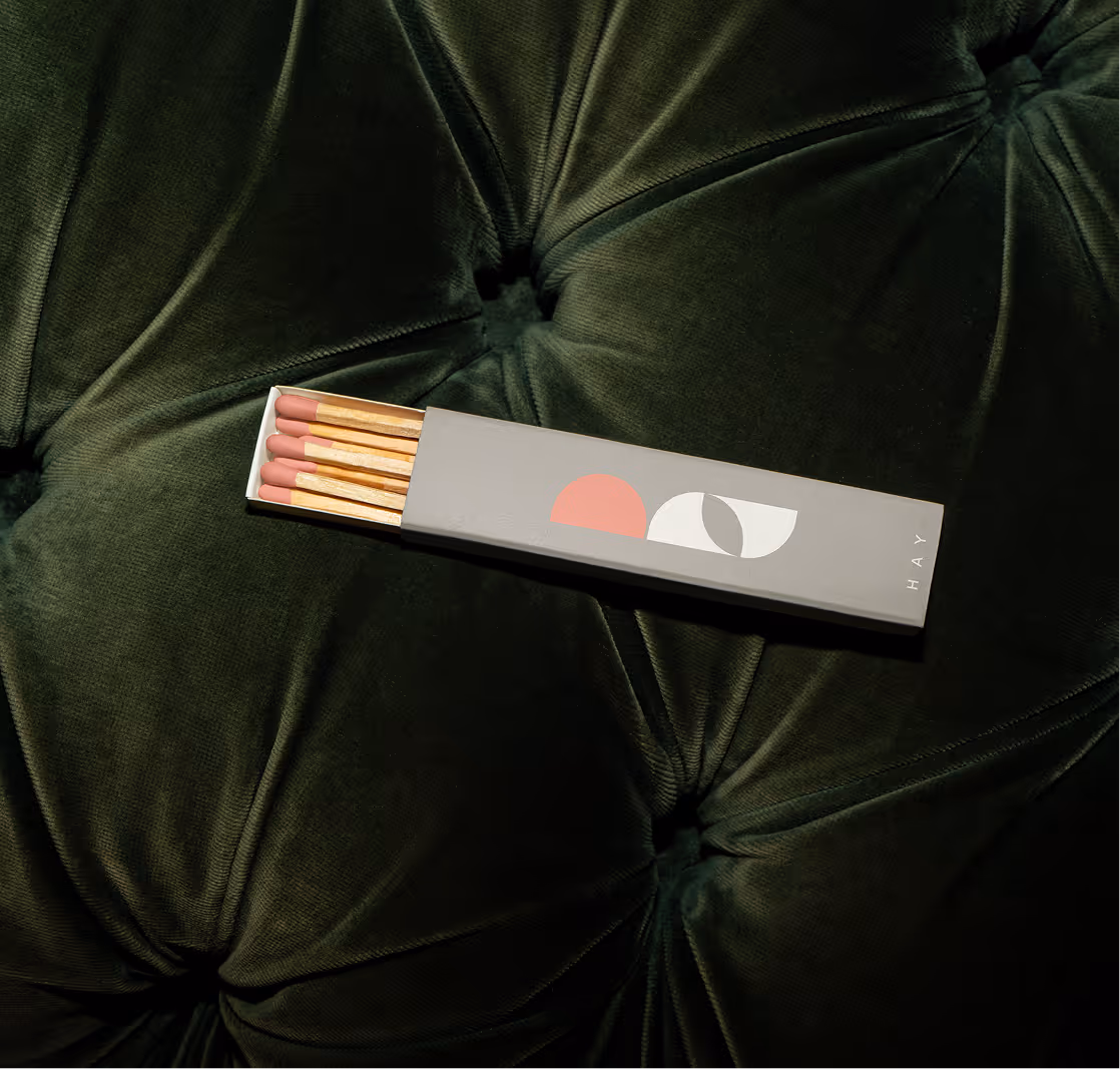
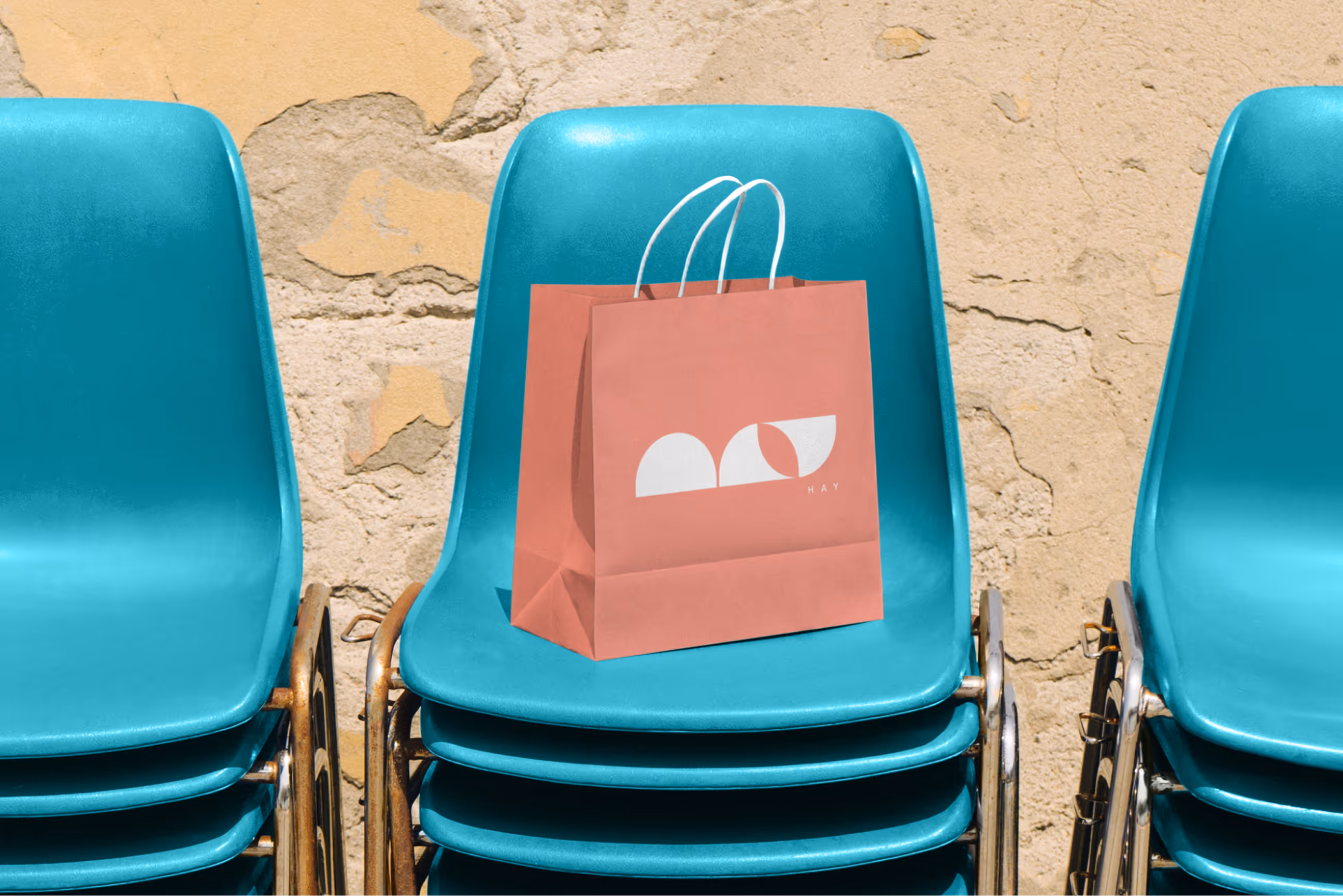
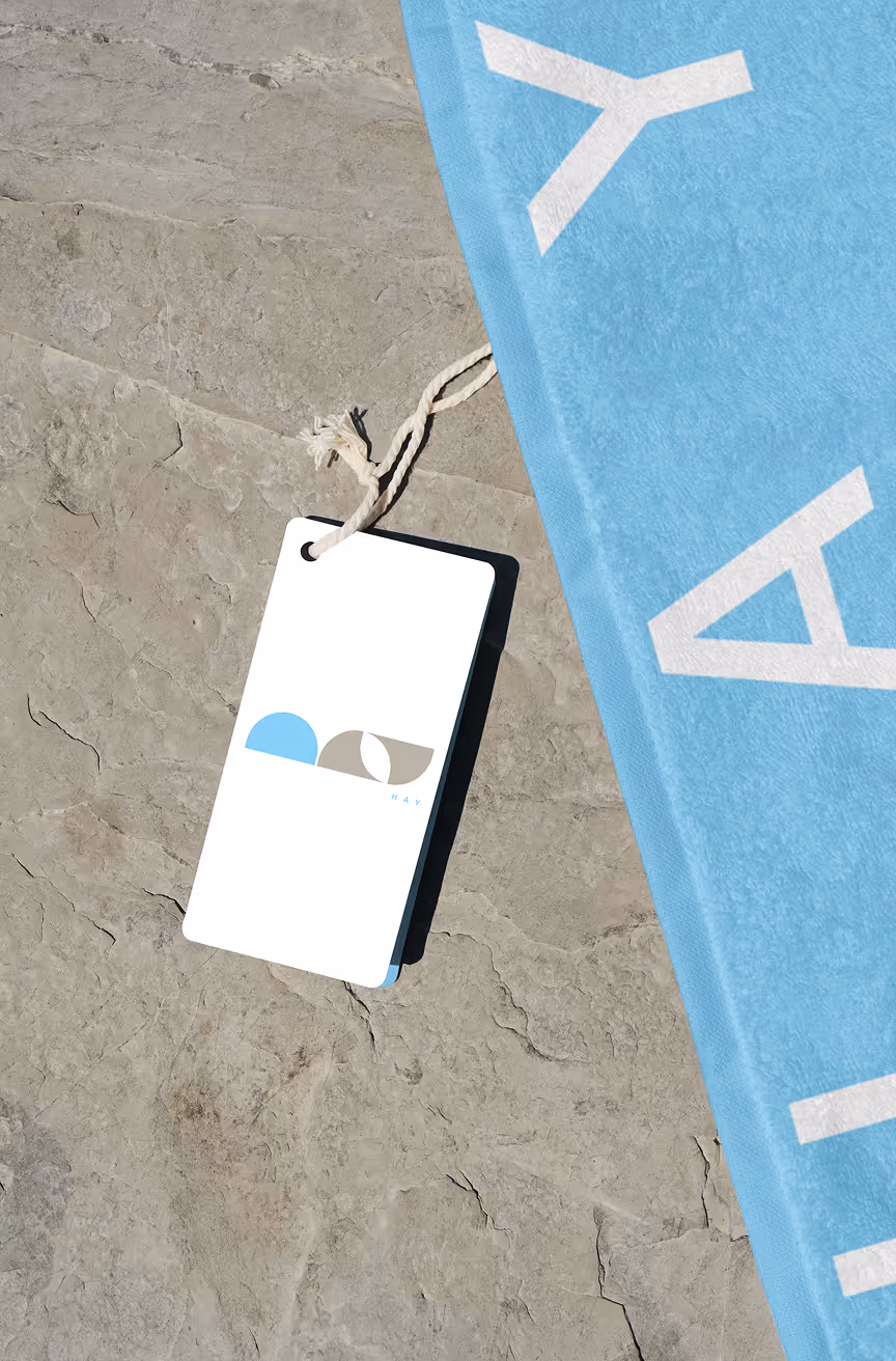
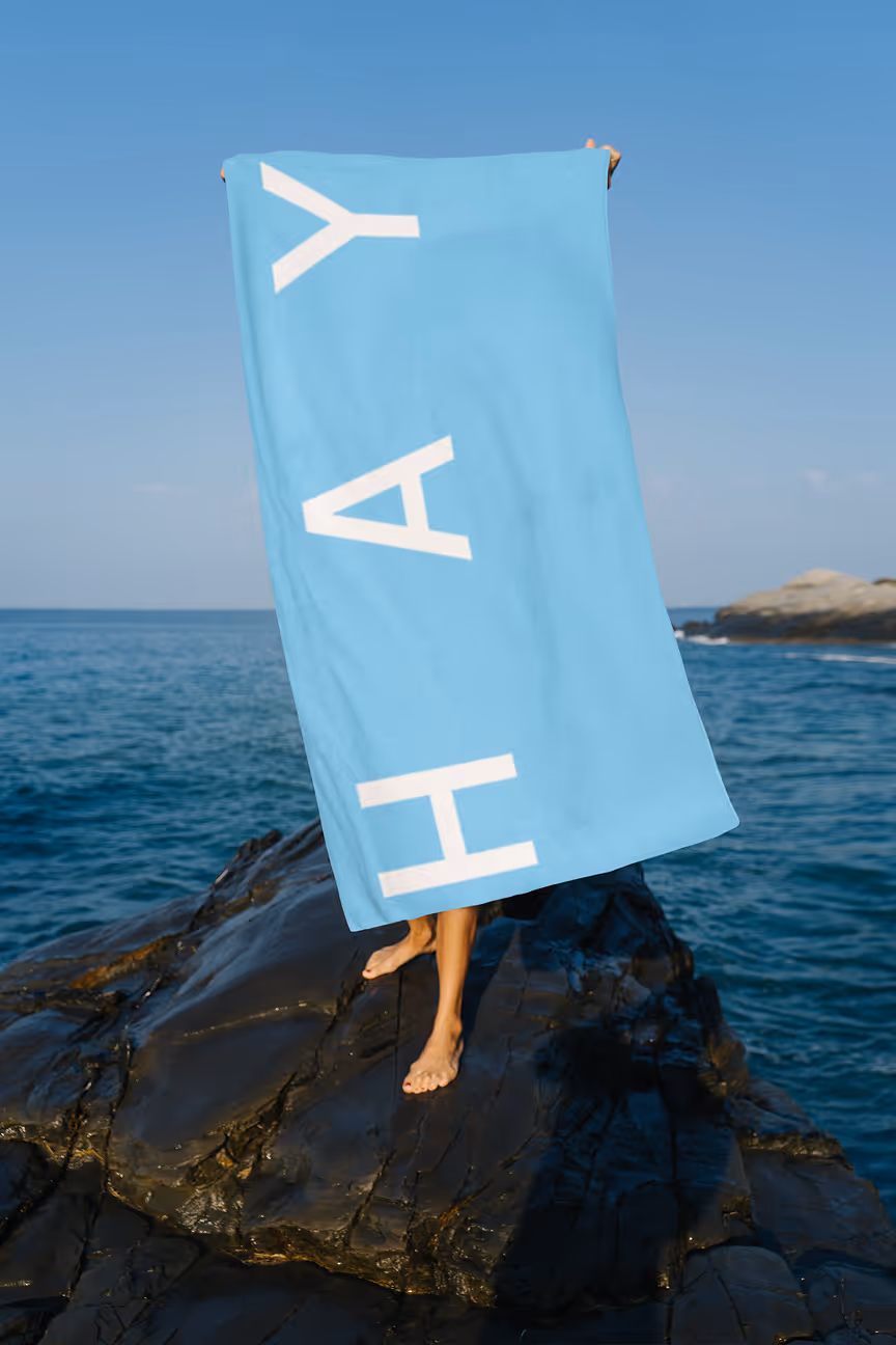
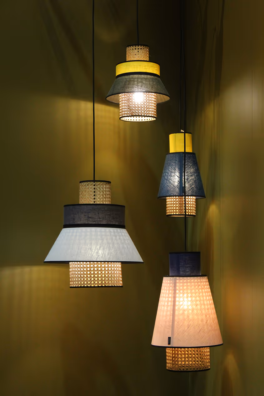
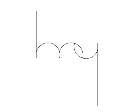
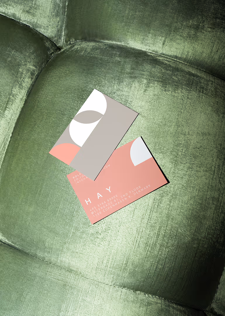
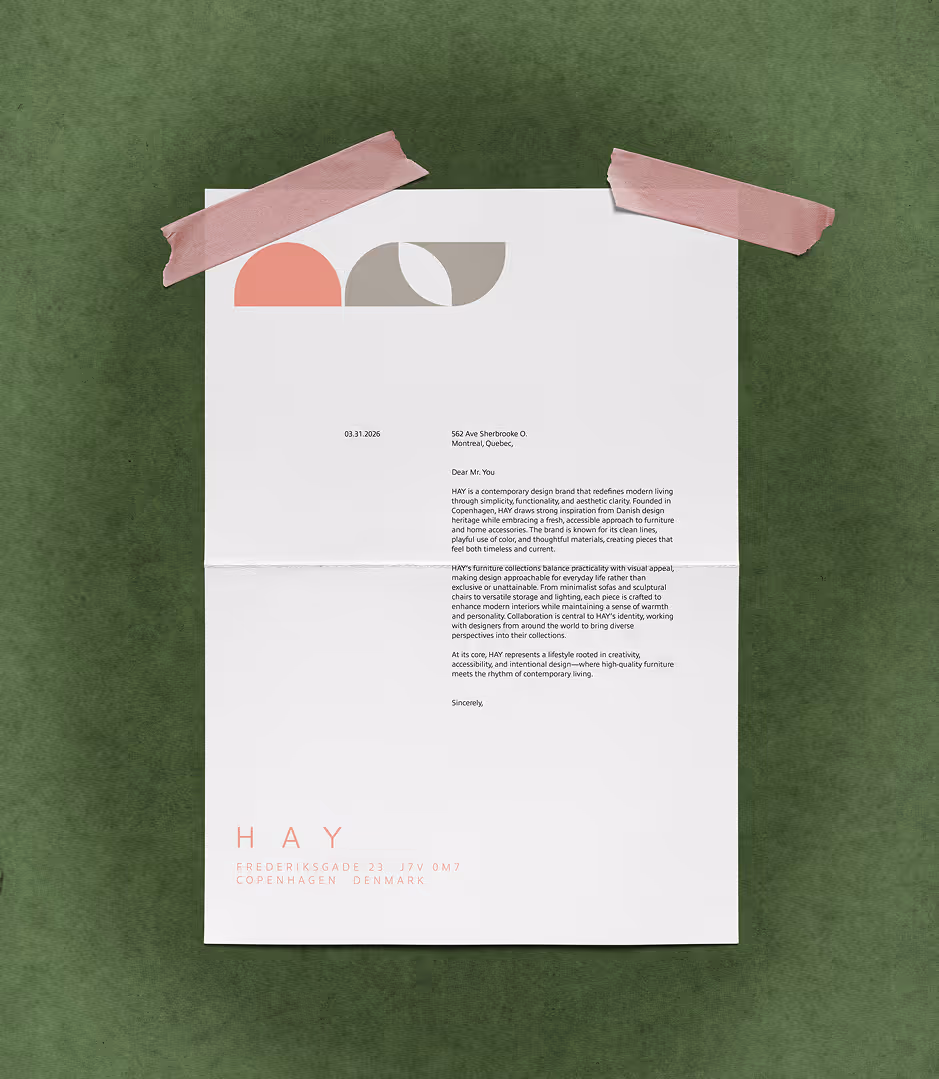
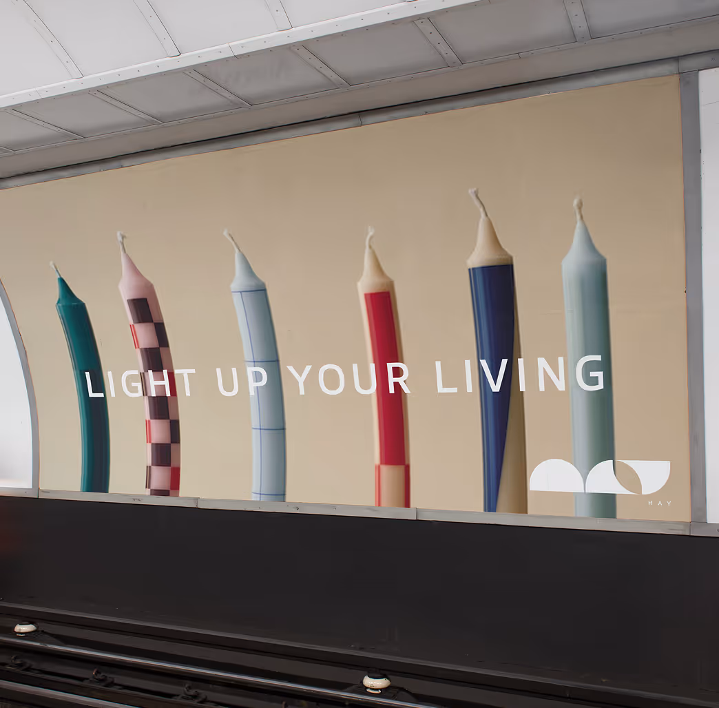
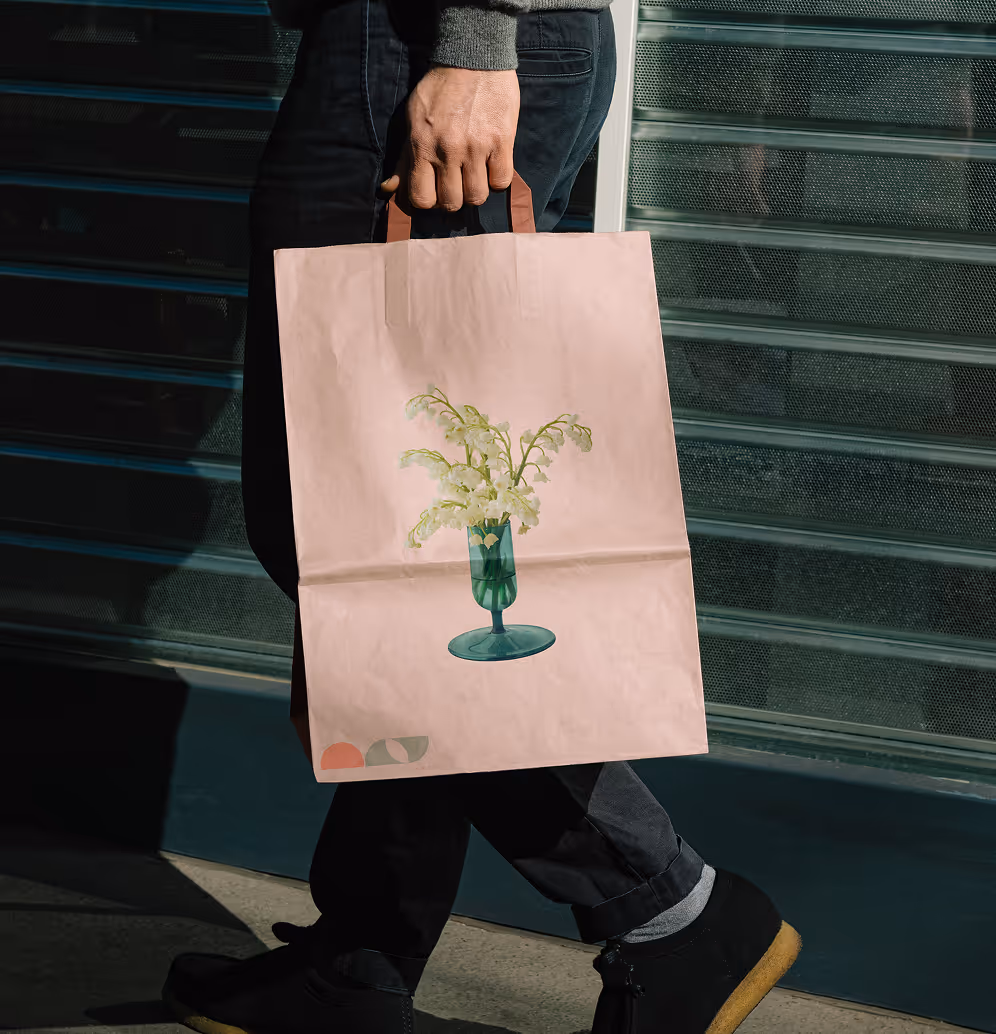
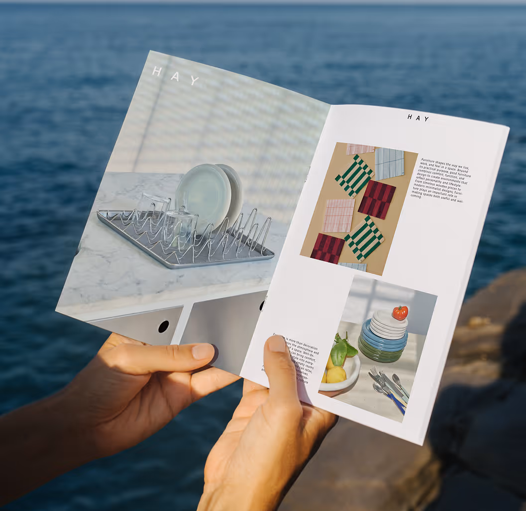
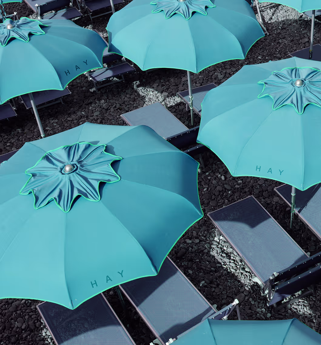
HAY is more than furniture,

it’s a feeling of simplicity, warmth, and intentional living. This rebrand focuses on creating a refreshed visual identity through a redesigned logo that reflects HAY’s modern and minimalist philosophy. Inspired by Scandinavian design principles, the new logo emphasizes clean forms, balance, and simplicity while maintaining the recognizable essence of the brand. The goal was to create a refined identity that feels timeless, approachable, and contemporary while strengthening HAY’s visual presence across platforms.

beach-towel tag hay
hay-beach-towel-mockup
green lights ceiling

logo

The logo originated from the brand “HAY,” written entirely in lowercase letters. While experimenting in Adobe Illustrator, I was able to create a series of interesting geometrical shapes that helped build the identity of the logo. By manipulating and simplifying the letterforms, I explored different compositions and structures that reflected a modern and minimal aesthetic. After several renderings and adjustments, the logo slowly evolved into a cleaner and more balanced design that still maintained the originality of the initial concept. The process allowed me to experiment creatively while also focusing on readability, proportion, and visual impact.
hay- lines for logohay- lines for logo
hay-structure
Rosewood Cushion
#F59184
c 0
m 52
y 41
k 0
Pebble Credenza
#B4AFA8
c 31
m 28
y 35
k 0
Citrine Lantern
#D8E47B
c 18
m 0
y 66
k 0
hay-logo
Seaside Soapdish
#82D1F5
c 44
m 2
y 0
k 0

APPLICATIONS

busniess card on couchletterheaed-branding
bed-hay-brandingcandle-metro-mockup
bag-mockup-bluebag-mockup-pink
cap hay!mini catalogue-hay
lighter-mockup haymokcup hay

simple furniture, luxury designs

conclusion-group ppl

checkout more of my works!

Branding
see more
Packaging
see more
Music Rebrand
see more
Videography
see more